Basic HTML Version


Q
uantitative
R
easoning &
P
roblem
S
olving
272
© 2014 Pacific Crest
M
ethodology
A
nalyzing a
G
raphical
D
isplay of
D
ata
(reference available on the companion website)
Step
Explanation
Watch it Work!
1.
Determine graph
type
Identify the format and then read
the title of the graph
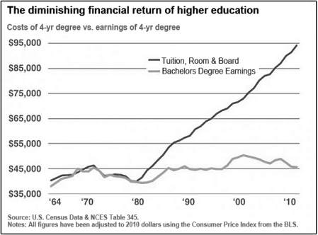
The graph is a line graph and compares
the cost of college with the average
salary of graduates
2.
Determine data
type
For each variable, determine
whether it is quantitative or
qualitative and identify the values
and units.
Both variables are quantitative and
measured in dollar amounts. The cost
of college is in the range $40,000 to
$95,000 and the earnings are in the
range $40,000 to $50,000
3.
Determine data
source
Locate the source of the data and
establish its reliability
The data is from the U.S. Census and
NCES which are reliable organizations
4.
Determine
patterns/trends
What can be inferred from the
graph and what does this mean in
the context of the situation
The graph illustrates increases in both
the cost of college and the earnings of
graduates, but shows a substantially
larger increase in the cost of college
that the earnings. We are tempted to
infer that college is becoming a bad
investment.

